


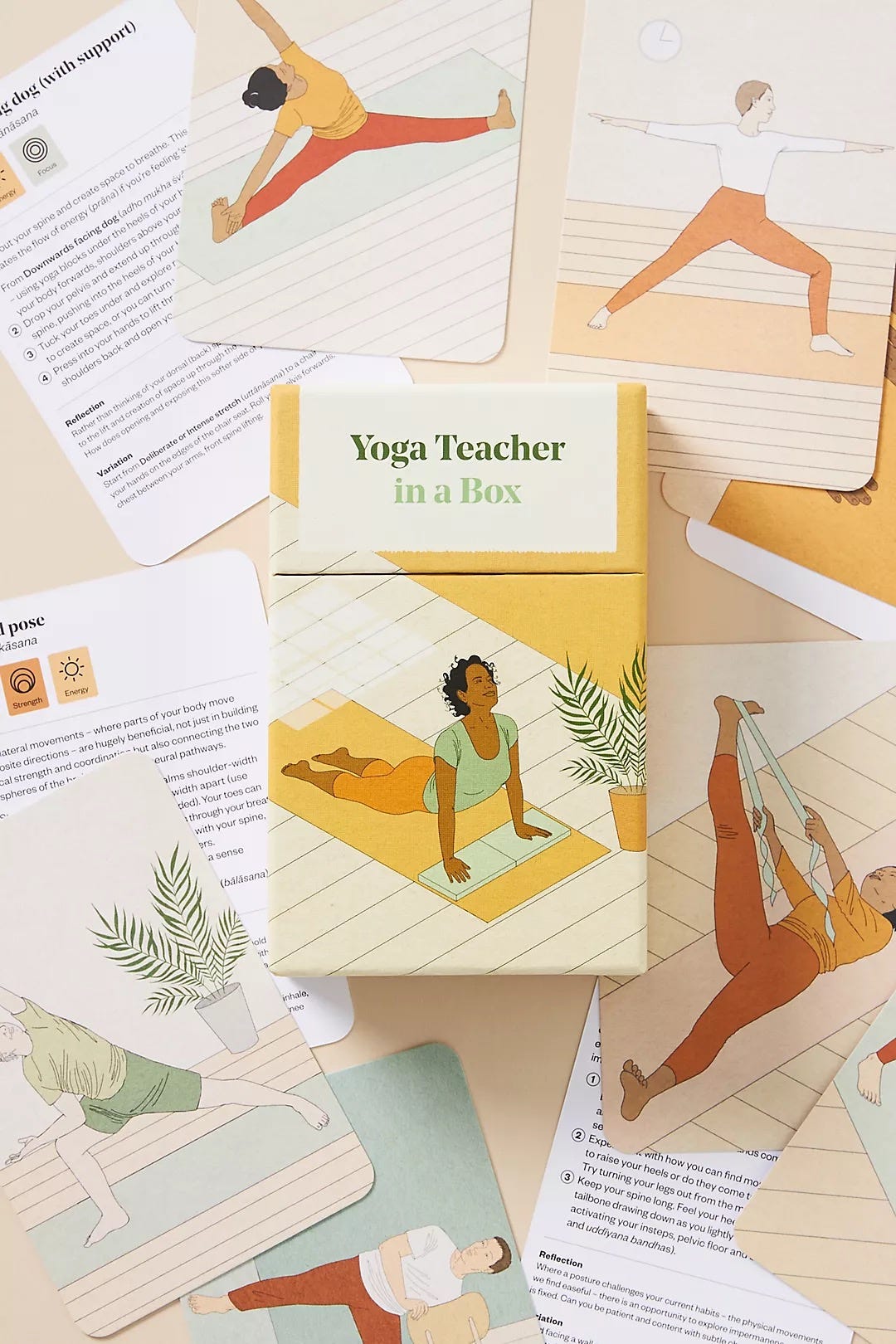
Illustrating Yoga Teacher in a Box

When Thames & Hudson approached me, alongside yoga teacher Leo Taylor (@centredspace), to illustrate Yoga Teacher in a Box, the goal was clear: to create something calming, accessible, and genuinely useful. The set of cards offers a practical way to engage with yoga, allowing you to follow sequences at your own pace.
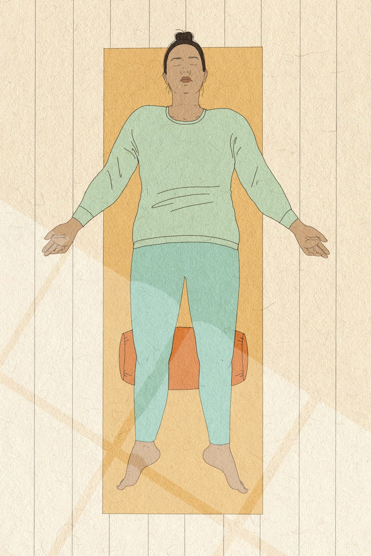
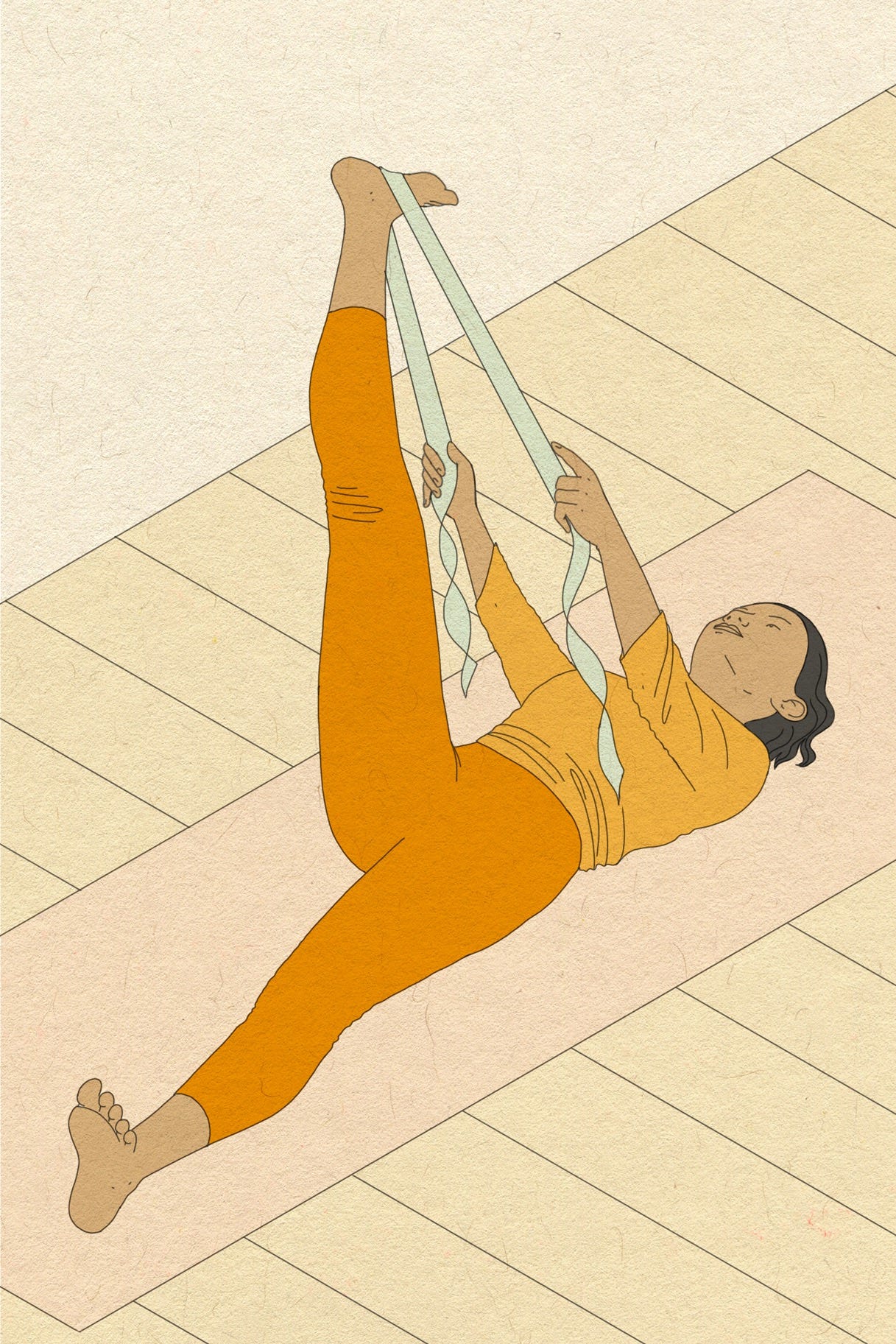
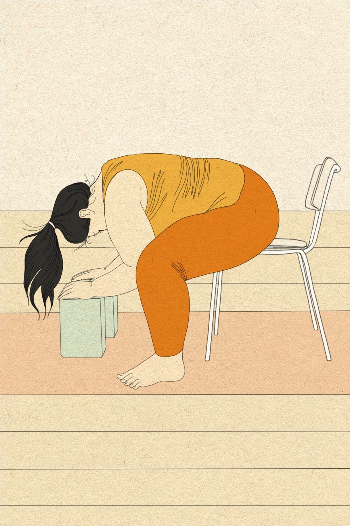
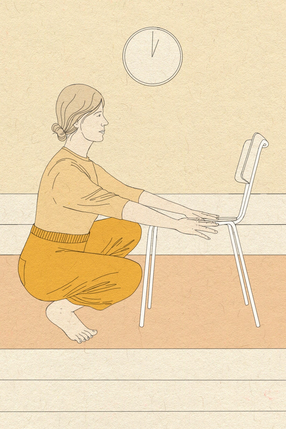
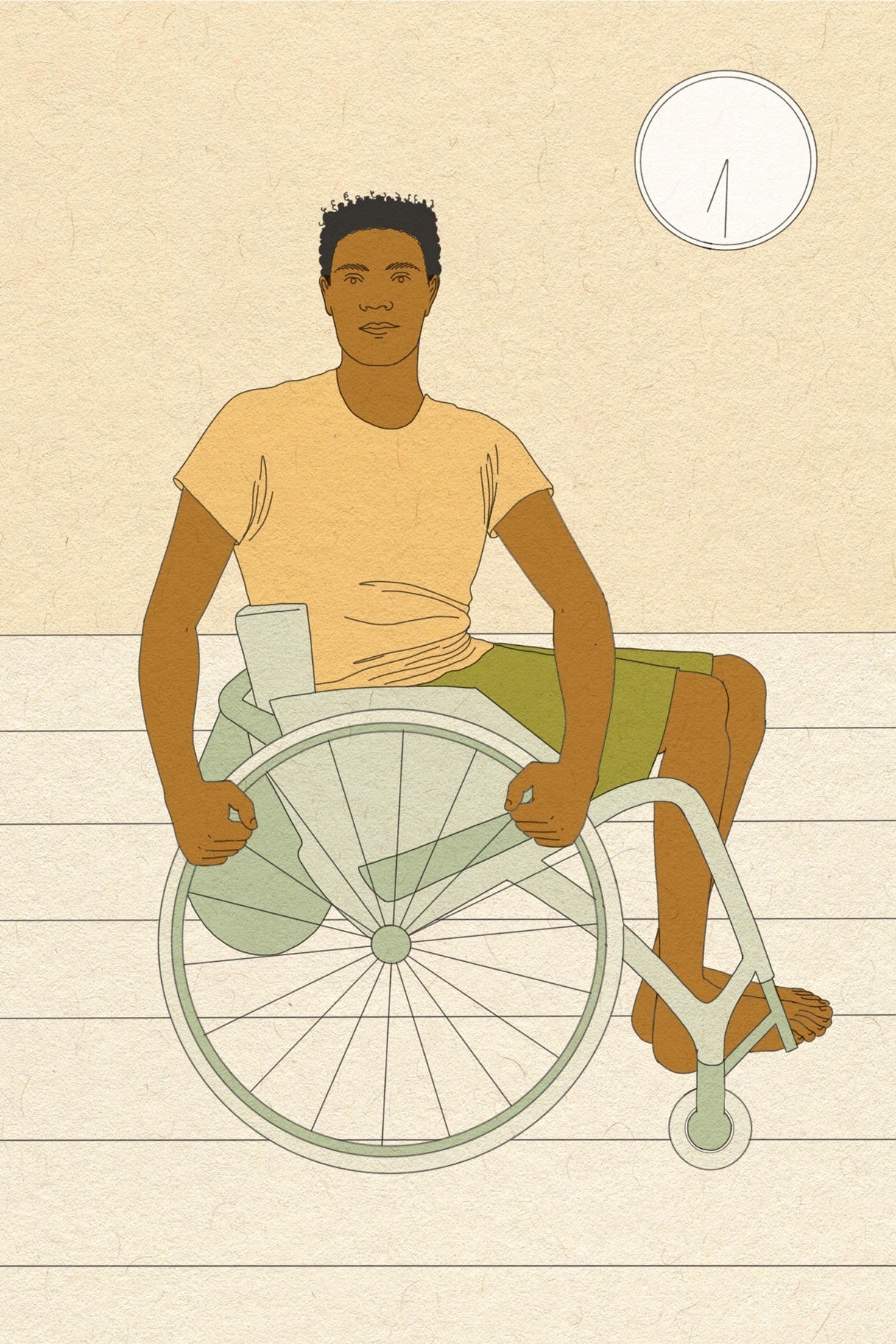
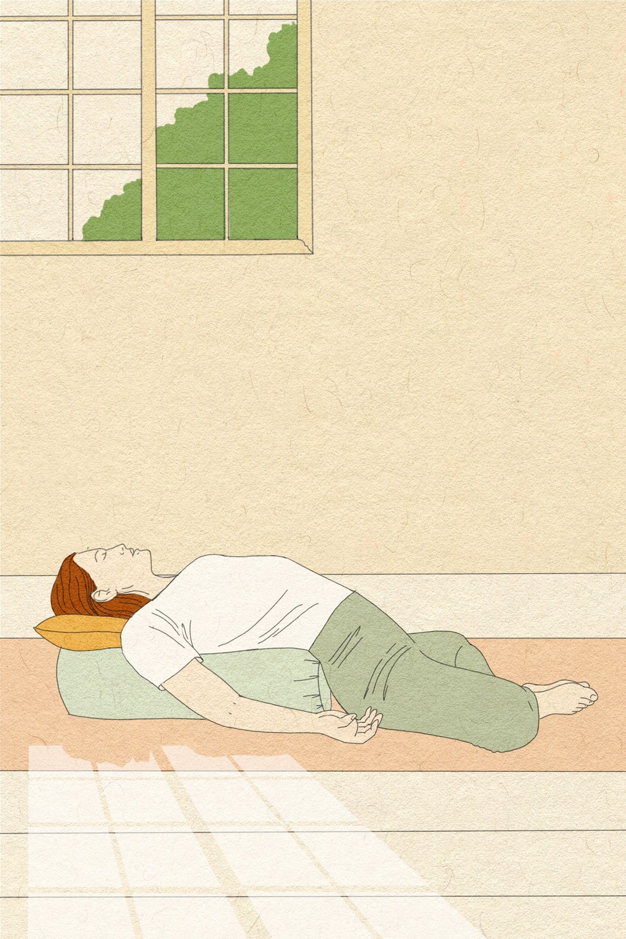
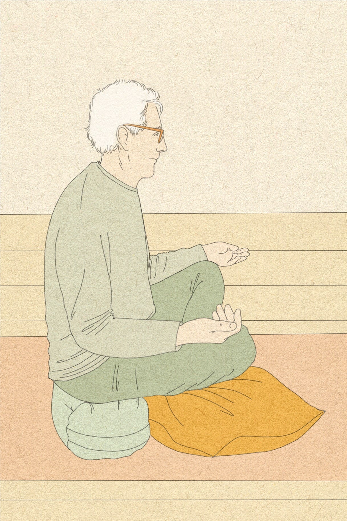
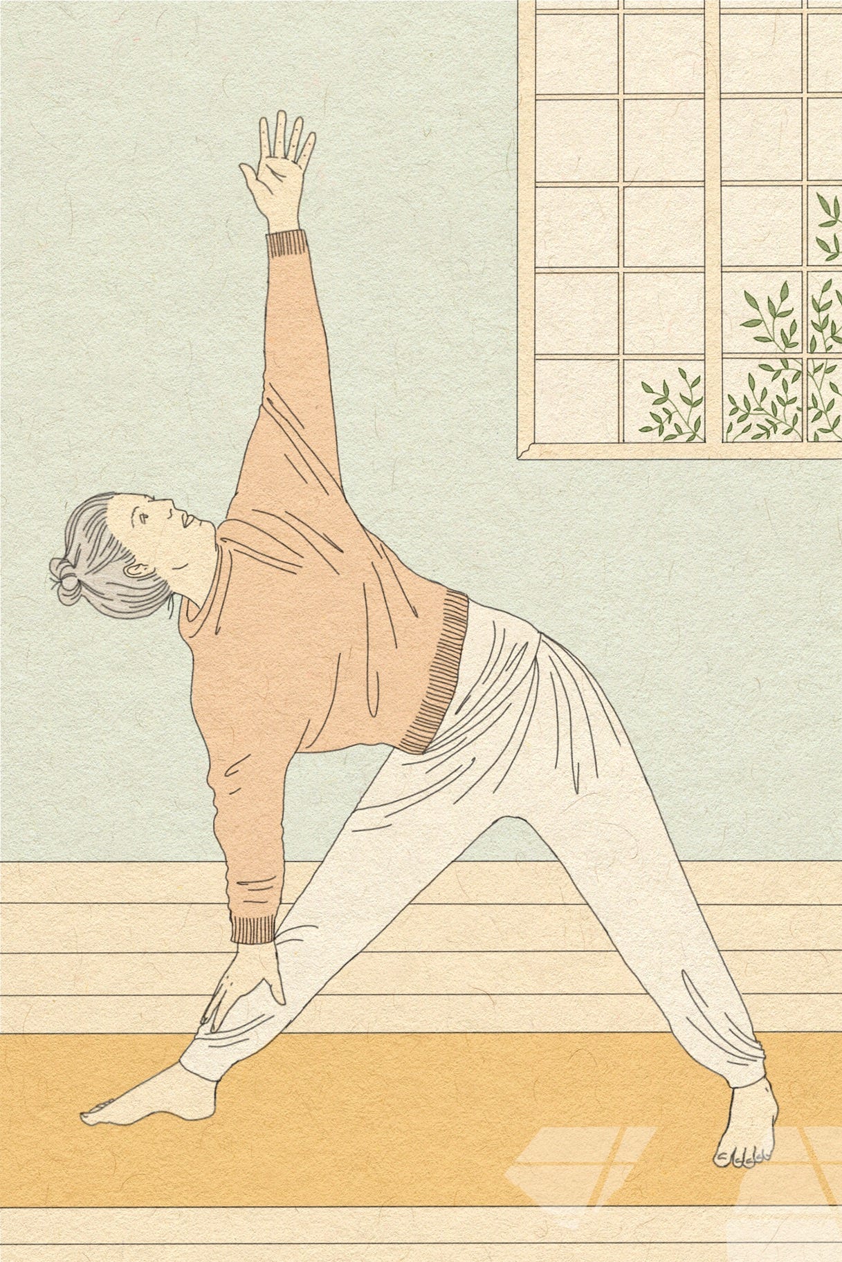
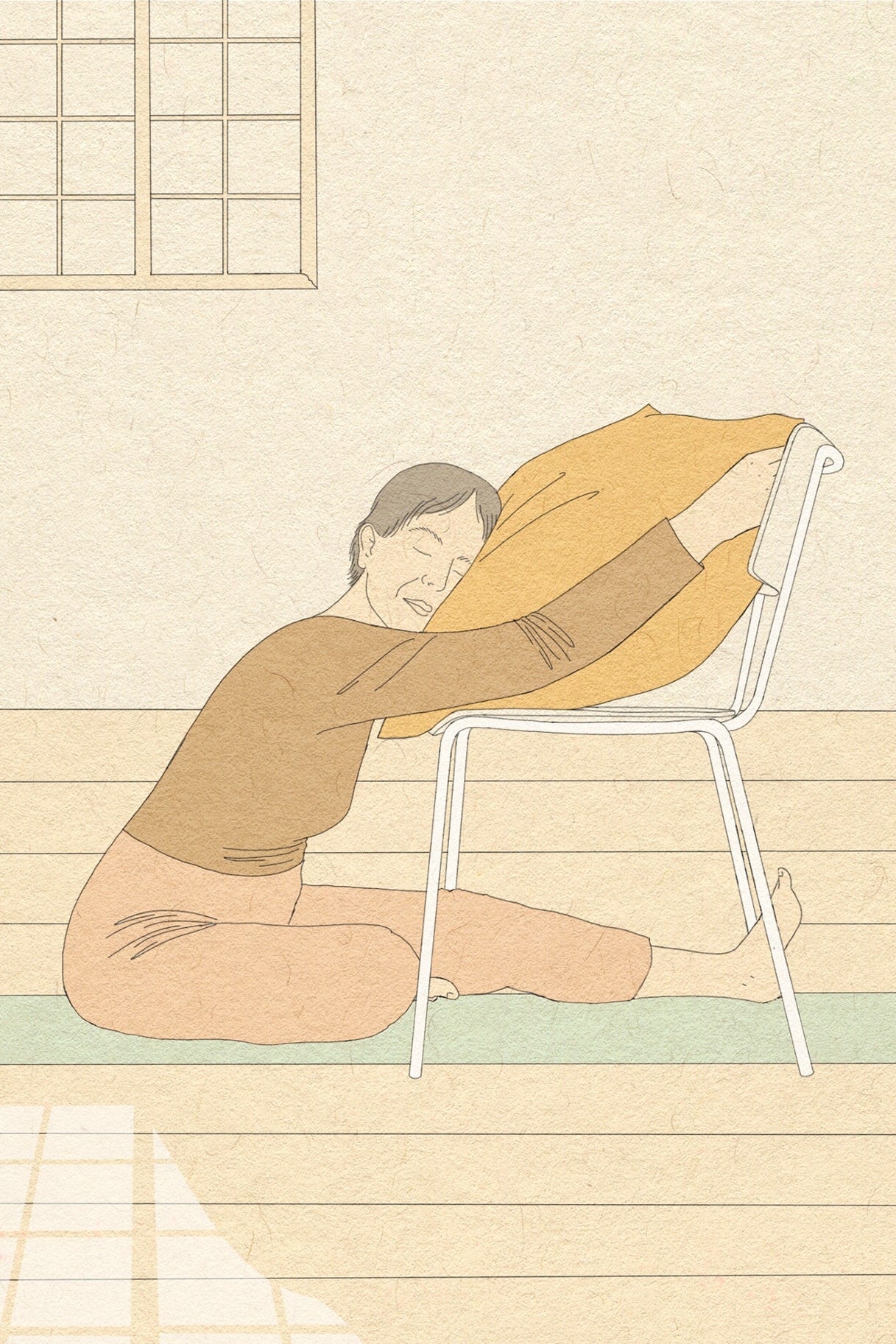
I began with the color palette. I wanted it to feel like stepping into an imagined yoga studio, tranquil, and inviting. Muted tones were paired with details like potted plants, simple furniture, and light spilling through windows to suggest a quiet, meditative space.
Some poses were depicted head-on, others at an isometric angle. This technique allowed me to fit full-body poses neatly onto the small dimensions of the cards.
A key principle of the project was to show that yoga isn’t about perfect aesthetics. Figures were drawn wearing loose, comfortable clothing to emphasise that yoga is for everyone.
I worked from reference photos provided by Leo, drawing from her network of teachers and students to represent a wide demographic. Diversity and inclusivity were central to the imagery, ensuring the illustrations reflected the variety of people who practice yoga.
While the poses are anatomically accurate, they were intentionally drawn to feel accessible rather than unattainably perfect.
The cards are designed to work for everyone, you can lay them out, create your own sequences, and move at your own pace. The result is a set of cards that invite you to explore yoga on your own terms—practical, and inclusive.
From start to finish the project took about 4 months to design the 60 artworks, and came out in March 2024.
Thanks for sharing such an amazing project! Did you design the whole card, or were you mainly focused on creating the illustrations?